Software and app updates related to 'card view' (page 2)
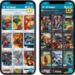 Another big update for your CLZ Comics app, in which we introduce a new view for your comic collection. But there’s more:
- Main screen:
- New “Card View”
- Selecting comics now also possible in Card View and Images View
- Floating “Add Comics” button (the big blue “+”) now auto-hides
- Add Comics screen:
- List View is back!
- “Add Manually” is back!
Read more
[CLZ News] What’s Cooking at the CLZ HQ? / New layout for CLZ Comics Add screen
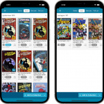 This is CLZ Alwin, bringing you the CLZ News for April 2022!
Strangely enough, only ONE new release this month (CLZ Comics 7.6). Well, not that strange really, as part of the team is working on big back-end projects and the rest on upcoming May releases.
So today’s newsletter is all about “What’s Cooking at the CLZ HQ?”:
- Now live:
- CLZ Comics 7.6: Bigger cover images in Add Comics screen
- What’s Cooking?
- A new partner for comic values!
- New “Card View” for all CLZ mobile apps
- Faster searches with our new search engine servers
- Multiple languages for the Connect web-based software!
Read more
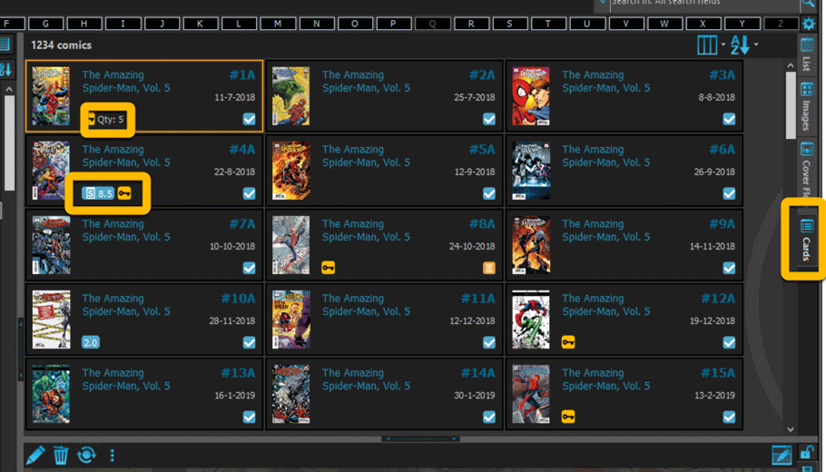
Updated Cards view:
A small re-design of the Cards View card, to make it closer to the look of the CLZ Comics mobile app list entries and the Card View in Comic Connect. So Card view now also shows the new Slabbed icon, grade, value and quantity.
Fixed:
- Add multiple comics manually was broken (Error “Ancestor for ‘pnAdditional’ not found”
- Statistics screen: “Top most valuable comics” and “Most valuable series” are back!
Two updates for the Book Connect software and the CLZ Cloud viewer today. One a big step forward in usability, the other a nice cosmetic improvement:
Book Details now integrated in main screen
Up till now, when you clicked a book entry to see its’ full details, you were taken to the book details page, that is, a new page in your browser. One had to click “Back” to get back to the book list again. Often resulting in an annoying back and forth clicking, each time causing you to lose your position in the list.
But not anymore! Starting with today’s update, the book details are now integrated in a panel within the main collection view:
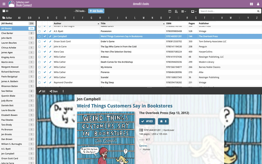
No more back and forth clicking. Just click a book entry to see its’ details, click another one to see that book’s details. Nice and easy, never lose your spot again.
Choose from two Layouts:
- Horizontal Split: folders on the left, list on the top right, details on bottom right
- Vertical Split: 3 panels side by side, folder, list and details
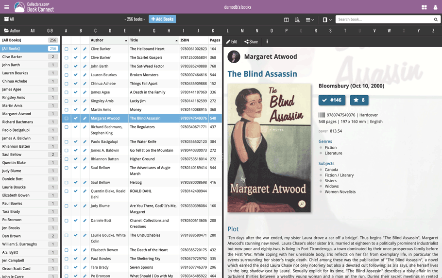
In either layout, the 3 panels are fully resizable by dragging the black “splitter bars” between the panels, so that you can customize the layout to your own liking.
The book details panel comes with its’ own “action bar”, with the main actions you may want to take on the selected book (Edit, Share, Delete, Duplicate, Loan and Link with Core).
Improved Cover View and Card View
At the same time, we made some small tweaks to both the Card View and Cover View, so that they’re making better use of your specific screen width. Both now use a “fully justified” layout, with the Cards auto-resizing to fit your screen width and the Cover distributing over the width, both resulting in a cleaner, less “jagged” view.
Two updates for the Game Connect software and the CLZ Cloud viewer today. One a big step forward in usability, the other a nice cosmetic improvement:
Game Details now integrated in main screen
Up till now, when you clicked a game entry to see its’ full details, you were taken to the game details page, that is, a new page in your browser. One had to click “Back” to get back to the game list again. Often resulting in an annoying back and forth clicking, each time causing you to lose your position in the list.
But not anymore! Starting with today’s update, the game details are now integrated in a panel within the main collection view:
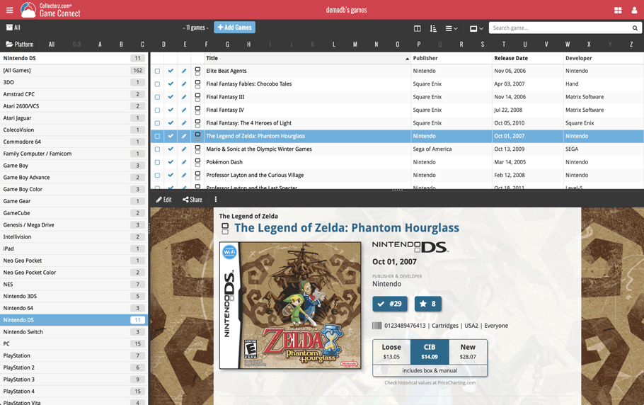
No more back and forth clicking. Just click a game entry to see its’ details, click another one to see that game’s details. Nice and easy, never lose your spot again.
Choose from two Layouts:
- Horizontal Split: folders on the left, list on the top right, details on bottom right
- Vertical Split: 3 panels side by side, folder, list and details
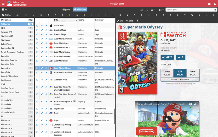
In either layout, the 3 panels are fully resizable by dragging the black “splitter bars” between the panels, so that you can customize the layout to your own liking.
The game details panel comes with its’ own “action bar”, with the main actions you may want to take on the selected game (Edit, Share, Delete, Duplicate, Loan and Link with Core).
Improved Cover View and Card View
At the same time, we made some small tweaks to both the Card View and Cover View, so that they’re making better use of your specific screen width. Both now use a “fully justified” layout, with the Cards auto-resizing to fit your screen width and the Covers distributing over the width, both resulting in a cleaner, less “jagged” view.
Two updates for the Music Connect software and the CLZ Cloud viewer today. One a big step forward in usability, the other a nice cosmetic improvement:
Album Details now integrated in main screen
Up till now, when you clicked an album entry to see its’ full details, you were taken to the album details page, that is, a new page in your browser. One had to click “Back” to get back to the album list again. Often resulting in an annoying back and forth clicking, each time causing you to lose your position in the list.
But not anymore! Starting with today’s update, the album details are now integrated in a panel within the main collection view:
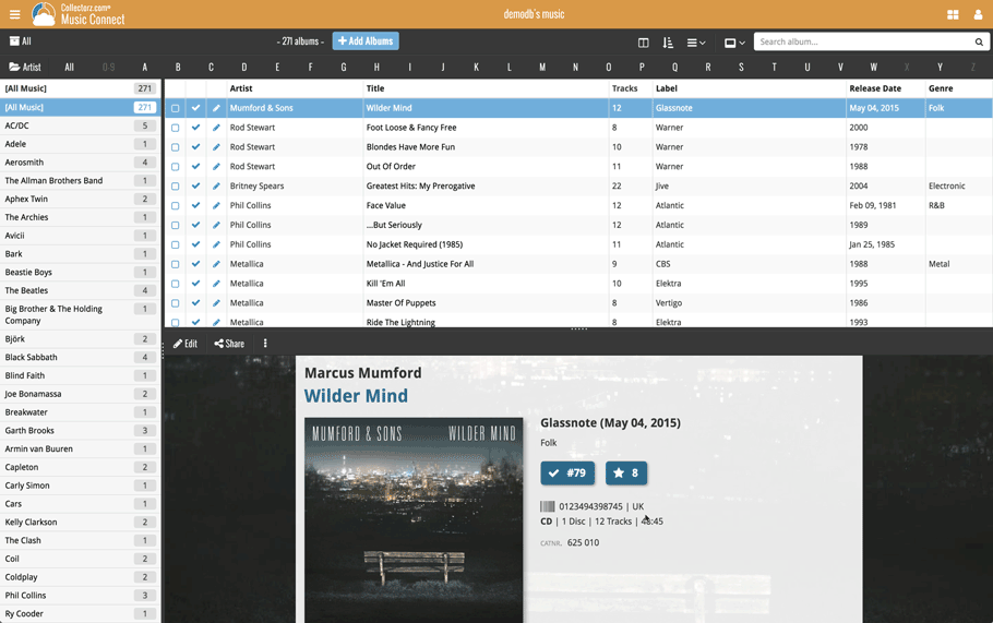
No more back and forth clicking. Just click an album entry to see its’ details, click another one to see that album’s details. Nice and easy, never lose your spot again.
Choose from two Layouts:
- Horizontal Split: folders on the left, list on the top right, details on bottom right
- Vertical Split: 3 panels side by side, folder, list and details
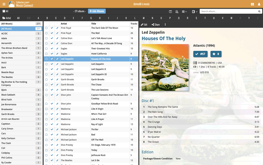
In either layout, the 3 panels are fully resizable by dragging the black “splitter bars” between the panels, so that you can customize the layout to your own liking.
The album details panel comes with its’ own “action bar”, with the main actions you may want to take on the selected album (Edit, Share, Delete, Duplicate, Loan and Link with Core).
Improved Cover View and Card View
At the same time, we made some small tweaks to both the Card View and Cover View, so that they’re making better use of your specific screen width. Both now use a “fully justified” layout, with the Cards auto-resizing to fit your screen width and the Covers distributing over the width, both resulting in a cleaner, less “jagged” view.
Two updates for the Comic Connect software and the CLZ Cloud viewer today. One a big step forward in usability, the other a nice cosmetic improvement:
Comic Details now integrated in main screen
Up till now, when you clicked a comic entry to see its’ full details, you were taken to the comic details page, that is, a new page in your browser. One had to click “Back” to get back to the comic list again. Often resulting in an annoying back and forth clicking, each time causing you to lose your position in the list.
But not anymore! Starting with today’s update, the comic details are now integrated in a panel within the main collection view:
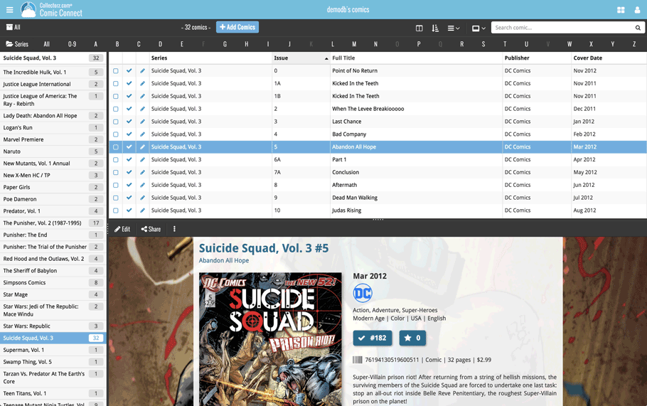
No more back and forth clicking. Just click a comic entry to see its’ details, click another one to see that comic’s details. Nice and easy, never lose your spot again.
Choose from two Layouts:
- Horizontal Split: folders on the left, list on the top right, details on bottom right
- Vertical Split: 3 panels side by side, folder, list and details
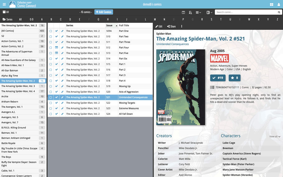
In either layout, the 3 panels are fully resizable by dragging the black “splitter bars” between the panels, so that you can customize the layout to your own liking.
The comic details panel comes with its’ own “action bar”, with the main actions you may want to take on the selected comic (Edit, Share, Delete, Duplicate, Loan and Link with Core).
Improved Cover View and Card View
At the same time, we made some small tweaks to both the Card View and Cover View, so that they’re making better use of your specific screen width. Both now use a “fully justified” layout, with the Cards auto-resizing to fit your screen width and the Covers distributing over the width, both resulting in a cleaner, less “jagged” view.
Two updates for the Movie Connect software and the CLZ Cloud viewer today. One a big step forward in usability, the other a nice cosmetic improvement:
Movie Details now integrated in main screen
Up till now, when you clicked a movie entry to see its’ full details, you were taken to the movie details page, that is, a new page in your browser. One had to click “Back” to get back to the movie list again. Often resulting in an annoying back and forth clicking, each time causing you to lose your position in the list.
But not anymore! Starting with today’s update, the movie details are now integrated in a panel within the main collection view:
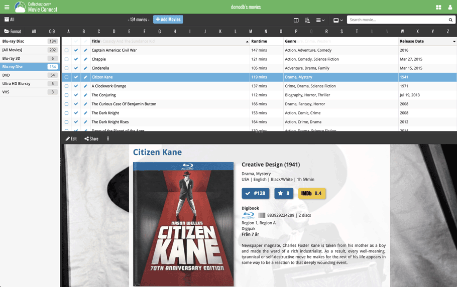
No more back and forth clicking. Just click a movie entry to see its’ details, click another one to see that movie’s details. Nice and easy, never lose your spot again.
Choose from two Layouts:
- Horizontal Split: folders on the left, list on the top right, details on bottom right
- Vertical Split: 3 panels side by side, folder, list and details
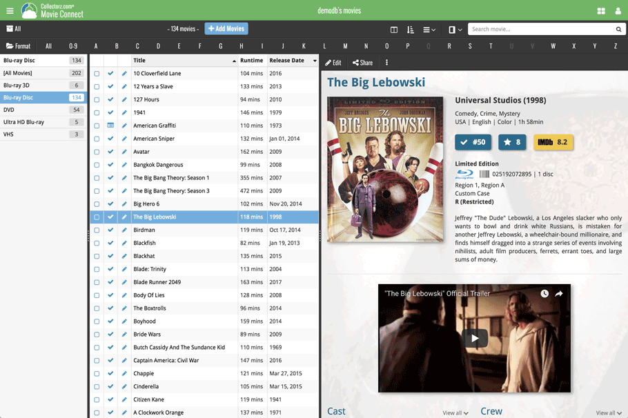
In either layout, the 3 panels are fully resizable by dragging the black “splitter bars” between the panels, so that you can customize the layout to your own liking.
The movie details panel comes with its’ own “action bar”, with the main actions you may want to take on the selected movie (Edit, Share, Delete, Duplicate, Loan and Link with Core).
Improved Cover View and Card View
At the same time, we made some small tweaks to both the Card View and Cover View, so that they’re making better use of your specific screen width. Both now use a “fully justified” layout, with the Cards auto-resizing to fit your screen width and the Covers distributing over the width, both resulting in a cleaner, less “jagged” view.
Fixed:
- Cards View: Quick Search didn’t filter the cards in the list.
- First Letter folder option was not using the Sort Names.
- Loan Manager Screen: Search was not working.
- Sierra: Full Screen Mode: “Add Cover” popup appears under the Edit Screen.
- Internal Images: Templates images were not updated after editing an item.
- When no internet connection was available, app was launched in Trial Mode.
- Templates : HTML content in Plots was not formatted correctly.
Fixed:
- Cards View: Quick Search didn’t filter the cards in the list.
- First Letter folder option was not using the Sort Names.
- Loan Manager Screen: Search was not working.
- Sierra: Full Screen Mode: “Add Cover” popup appears under the Edit Screen.
- Internal Images: Templates images were not updated after editing an item.
- When no internet connection was available, app was launched in Trial Mode.
- Main List: Missing “Format Icon” for movies without formats
Fixed:
- Cards View: Quick Search didn’t filter the cards in the list.
- First Letter folder option was not using the Sort Names.
- Loan Manager Screen: Search was not working.
- Sierra: Full Screen Mode: “Add Cover” popup appears under the Edit Screen.
- Internal Images: Templates images were not updated after editing an item.
- When no internet connection was available, app was launched in Trial Mode.
Fixed:
- Edit In List: some checkboxes didn’t trigger a sync change
- Cards View: Find Cover: select new cover. New Cover was not displayed.
- Add Auto: Queue mode > Add Selected: sometimes all (not selected) queue items were added
- Main Screen: 2 Horizontal Panels: Layout Sizes were not restored
- Add Automatically: By Barcode: Sometimes a new album was added without barcode
- Manage Pick Lists: Didn’t always show any warning for duplicate items
Fixed:
- Edit In List: some checkboxes didn’t trigger a sync change
- Cards View: Find Cover: select new cover. New Cover was not displayed.
- Add Auto: Queue mode > Add Selected: sometimes all (not selected) queue items were added
- Main Screen: 2 Horizontal Panels: Layout Sizes were not restored
- Add Automatically: By Barcode: Sometimes a new comic was added without barcode
- Manage Pick Lists: Didn’t always show any warning for duplicate items
v16.0.7: Added ISBN icon back into the template and some more fixes
Fixed:
- Templates:
- Credits with role “Author” were not listed
- Template: ISBN icon was missing
- Duplicate Book: Stories were not copied
- Main Screen: Edit in List
- un(checking) checkbox lists didn’t trigger a “sync change”
- changing “Read It” and “Changing Date” didn’t trigger a “sync change”
- Cards View: the new cover was not displayed using Find Cover
- Add Auto: sometimes not selected queue items were also added using “Add Selected” in queue mode
v16.0.7: Added barcode icon back into the template and some more fixes
Fixed:
- Templates: Template: Barcode icon was missing
- Main Screen: Edit in List
- un(checking) checkbox lists didn’t trigger a “sync change”
- changing “Seen It” and “Changing Date” didn’t trigger a “sync change”
- Cards View: the new cover was not displayed using Find Cover
- Add Auto: sometimes not selected queue items were also added using “Add Selected” in queue mode
- Export to Text: Running Time was not displaying in correct format
v16.2.2: Fixed some issues in the main screen and quick search
Fixed:
- Main Screen:
- Cards View: selection wasn’t always restored properly
- Scrolling the Details View with the mouse wheel would scroll the list when the scroll bar reached the top
- Quick search:
- pasting text into quick search box didn’t show the clear button
- Escape button will now clear quick search
- Sync with Cloud: cancelling sync didn’t always work
Fixed:
- Edit Album/Track: changing the instrument for a musician would mark all albums this musician appeared as “dirty”
- Main Screen:
- When composition composers weren’t filled in, the composer field would still show semicolons
- Cards View: selection wasn’t always restored properly
- Scrolling the Details View with the mouse wheel would scroll the list when the scroll bar reached the top
- Quick search:
- pasting text into quick search box didn’t show the clear button
- Escape button will now clear quick search
- Sync with Cloud: cancelling sync didn’t always work
Fixed:
- Main Screen Cards View: selection wasn’t always restored properly
- Quick search:
- Pasting text into quick search box didn’t show the clear button
- Escape button will now clear quick search
- Translation file contained wrong French translation
Fixed:
- Menu: “View > Cards” item was missing
- Cards View was not working on Mavericks
- Tracks View: List: it was not possible to sort by Album Index
Fixed:
- Menu: “View > Cards” item was missing
- Cards View was not working on Mavericks
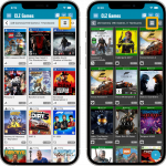 Another big update for your CLZ Games app, in which we introduce a new view for your game collection. But there’s more:
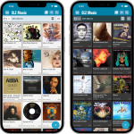 Another big update for your CLZ Music app, in which we introduce a new view for your music collection. But there’s more:
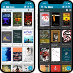 Another big update for your CLZ Books app, in which we introduce a new view for your book collection. But there’s more:
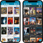 Another big update for your CLZ Movies app, in which we introduce a new view for your movie collection. But there’s more: