Software and app updates related to 'images view' (page 2)
Two updates for the Game Connect software and the CLZ Cloud viewer today. One a big step forward in usability, the other a nice cosmetic improvement:
Game Details now integrated in main screen
Up till now, when you clicked a game entry to see its’ full details, you were taken to the game details page, that is, a new page in your browser. One had to click “Back” to get back to the game list again. Often resulting in an annoying back and forth clicking, each time causing you to lose your position in the list.
But not anymore! Starting with today’s update, the game details are now integrated in a panel within the main collection view:
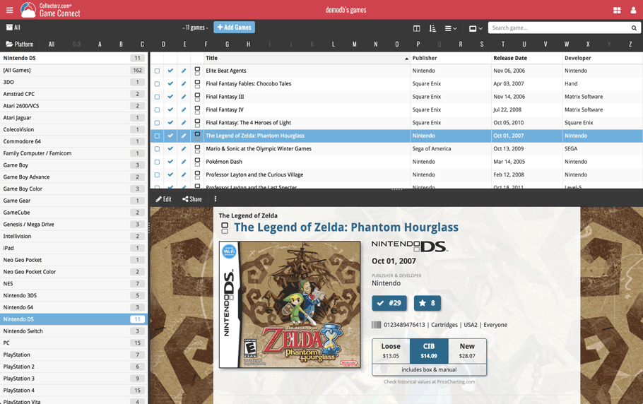
No more back and forth clicking. Just click a game entry to see its’ details, click another one to see that game’s details. Nice and easy, never lose your spot again.
Choose from two Layouts:
- Horizontal Split: folders on the left, list on the top right, details on bottom right
- Vertical Split: 3 panels side by side, folder, list and details
In either layout, the 3 panels are fully resizable by dragging the black “splitter bars” between the panels, so that you can customize the layout to your own liking.
The game details panel comes with its’ own “action bar”, with the main actions you may want to take on the selected game (Edit, Share, Delete, Duplicate, Loan and Link with Core).
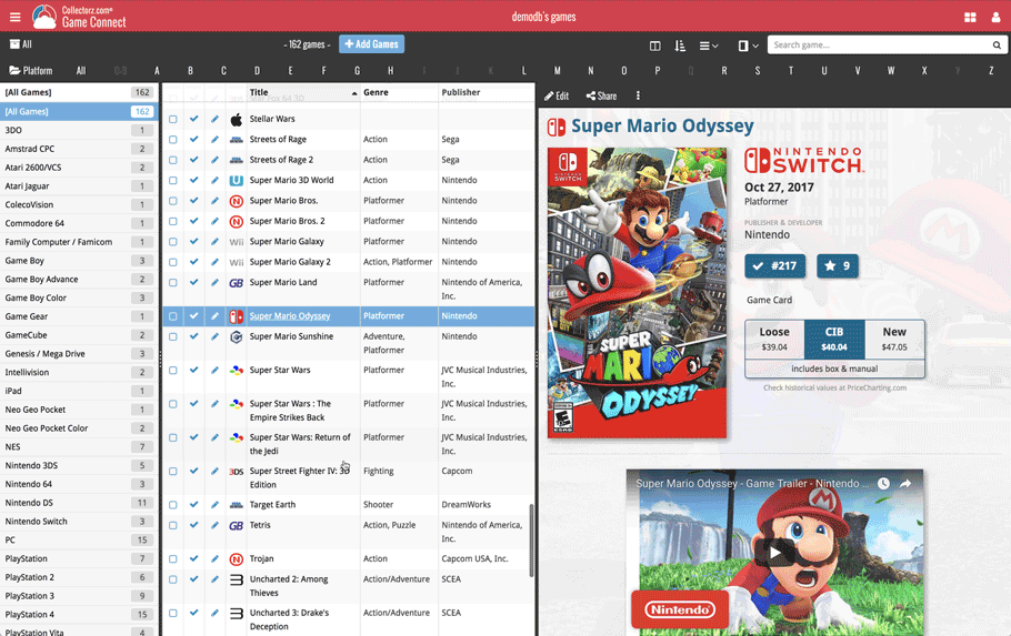
Improved Cover View and Card View
At the same time, we made some small tweaks to both the Card View and Cover View, so that they’re making better use of your specific screen width. Both now use a “fully justified” layout, with the Cards auto-resizing to fit your screen width and the Covers distributing over the width, both resulting in a cleaner, less “jagged” view.
Two updates for the Music Connect software and the CLZ Cloud viewer today. One a big step forward in usability, the other a nice cosmetic improvement:
Album Details now integrated in main screen
Up till now, when you clicked an album entry to see its’ full details, you were taken to the album details page, that is, a new page in your browser. One had to click “Back” to get back to the album list again. Often resulting in an annoying back and forth clicking, each time causing you to lose your position in the list.
But not anymore! Starting with today’s update, the album details are now integrated in a panel within the main collection view:
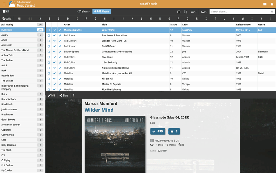
No more back and forth clicking. Just click an album entry to see its’ details, click another one to see that album’s details. Nice and easy, never lose your spot again.
Choose from two Layouts:
- Horizontal Split: folders on the left, list on the top right, details on bottom right
- Vertical Split: 3 panels side by side, folder, list and details
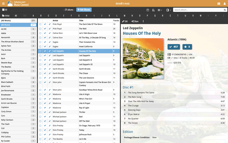
In either layout, the 3 panels are fully resizable by dragging the black “splitter bars” between the panels, so that you can customize the layout to your own liking.
The album details panel comes with its’ own “action bar”, with the main actions you may want to take on the selected album (Edit, Share, Delete, Duplicate, Loan and Link with Core).
Improved Cover View and Card View
At the same time, we made some small tweaks to both the Card View and Cover View, so that they’re making better use of your specific screen width. Both now use a “fully justified” layout, with the Cards auto-resizing to fit your screen width and the Covers distributing over the width, both resulting in a cleaner, less “jagged” view.
Two updates for the Comic Connect software and the CLZ Cloud viewer today. One a big step forward in usability, the other a nice cosmetic improvement:
Comic Details now integrated in main screen
Up till now, when you clicked a comic entry to see its’ full details, you were taken to the comic details page, that is, a new page in your browser. One had to click “Back” to get back to the comic list again. Often resulting in an annoying back and forth clicking, each time causing you to lose your position in the list.
But not anymore! Starting with today’s update, the comic details are now integrated in a panel within the main collection view:
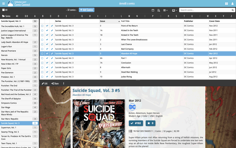
No more back and forth clicking. Just click a comic entry to see its’ details, click another one to see that comic’s details. Nice and easy, never lose your spot again.
Choose from two Layouts:
- Horizontal Split: folders on the left, list on the top right, details on bottom right
- Vertical Split: 3 panels side by side, folder, list and details
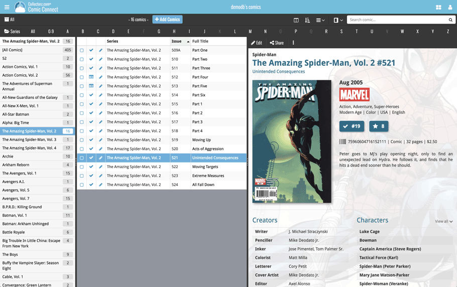
In either layout, the 3 panels are fully resizable by dragging the black “splitter bars” between the panels, so that you can customize the layout to your own liking.
The comic details panel comes with its’ own “action bar”, with the main actions you may want to take on the selected comic (Edit, Share, Delete, Duplicate, Loan and Link with Core).
Improved Cover View and Card View
At the same time, we made some small tweaks to both the Card View and Cover View, so that they’re making better use of your specific screen width. Both now use a “fully justified” layout, with the Cards auto-resizing to fit your screen width and the Covers distributing over the width, both resulting in a cleaner, less “jagged” view.
Two updates for the Movie Connect software and the CLZ Cloud viewer today. One a big step forward in usability, the other a nice cosmetic improvement:
Movie Details now integrated in main screen
Up till now, when you clicked a movie entry to see its’ full details, you were taken to the movie details page, that is, a new page in your browser. One had to click “Back” to get back to the movie list again. Often resulting in an annoying back and forth clicking, each time causing you to lose your position in the list.
But not anymore! Starting with today’s update, the movie details are now integrated in a panel within the main collection view:
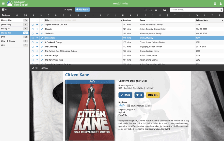
No more back and forth clicking. Just click a movie entry to see its’ details, click another one to see that movie’s details. Nice and easy, never lose your spot again.
Choose from two Layouts:
- Horizontal Split: folders on the left, list on the top right, details on bottom right
- Vertical Split: 3 panels side by side, folder, list and details
In either layout, the 3 panels are fully resizable by dragging the black “splitter bars” between the panels, so that you can customize the layout to your own liking.
The movie details panel comes with its’ own “action bar”, with the main actions you may want to take on the selected movie (Edit, Share, Delete, Duplicate, Loan and Link with Core).
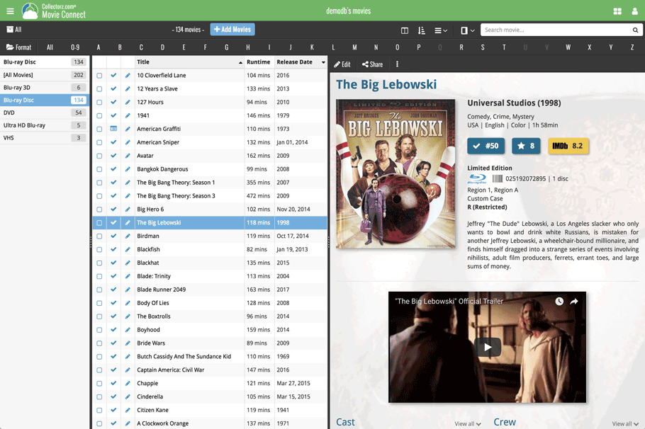
Improved Cover View and Card View
At the same time, we made some small tweaks to both the Card View and Cover View, so that they’re making better use of your specific screen width. Both now use a “fully justified” layout, with the Cards auto-resizing to fit your screen width and the Covers distributing over the width, both resulting in a cleaner, less “jagged” view.