What's new in CLZ Comics for iOS?
 For this update, the main goal was to make the cover images in the Add Comics screen bigger, to make it easier to find the issue or variant that you own.
However, while working on that, we ran into many other things that could be improved, so we figured why not? So in the end, it turned out be a serious overhaul of the Add Comics screen 🙂
Here’s an overview of all the improvements:
- Bigger cover images in the Issue List
- The Issue List for a series now opens in a separate page
- Preview Page now also shows a bigger cover image
- New look or series search results and series search “suggestions box”
- Close the Add Comics screen with “X” top left, no more “double back button” confusion
Bigger cover images in the Issue List
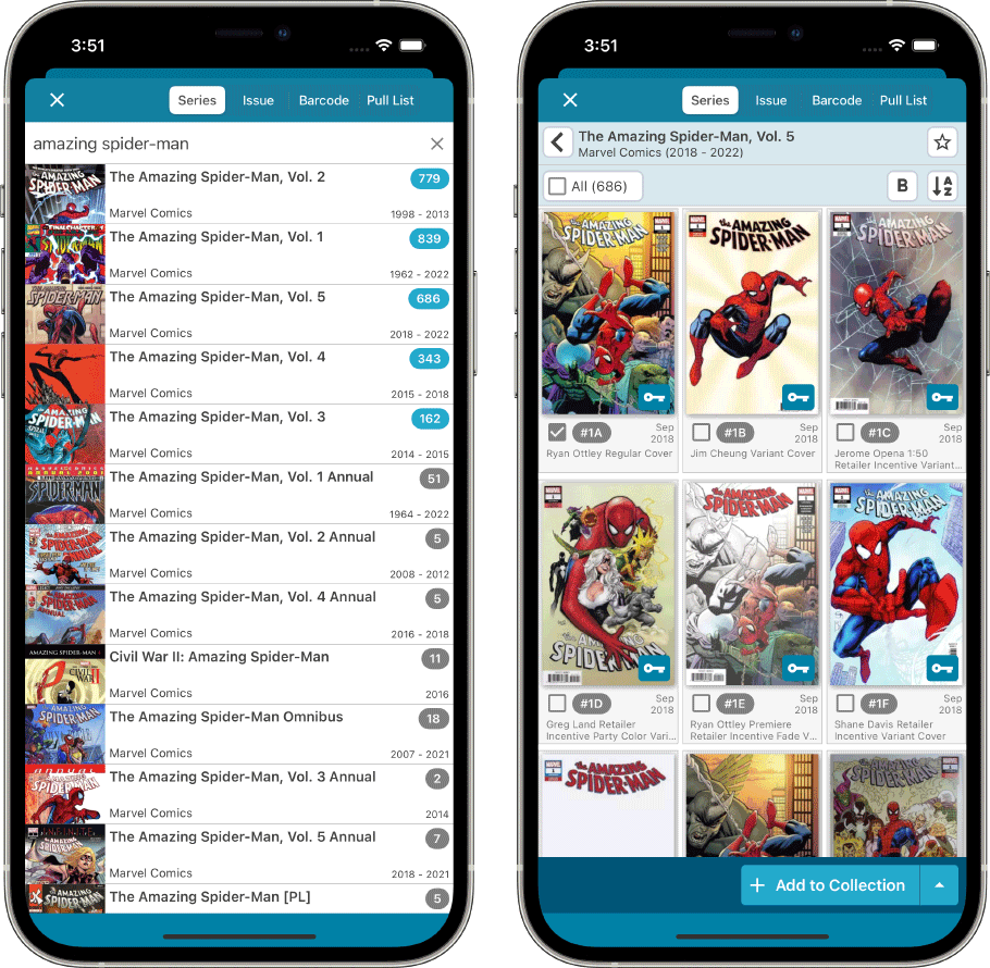
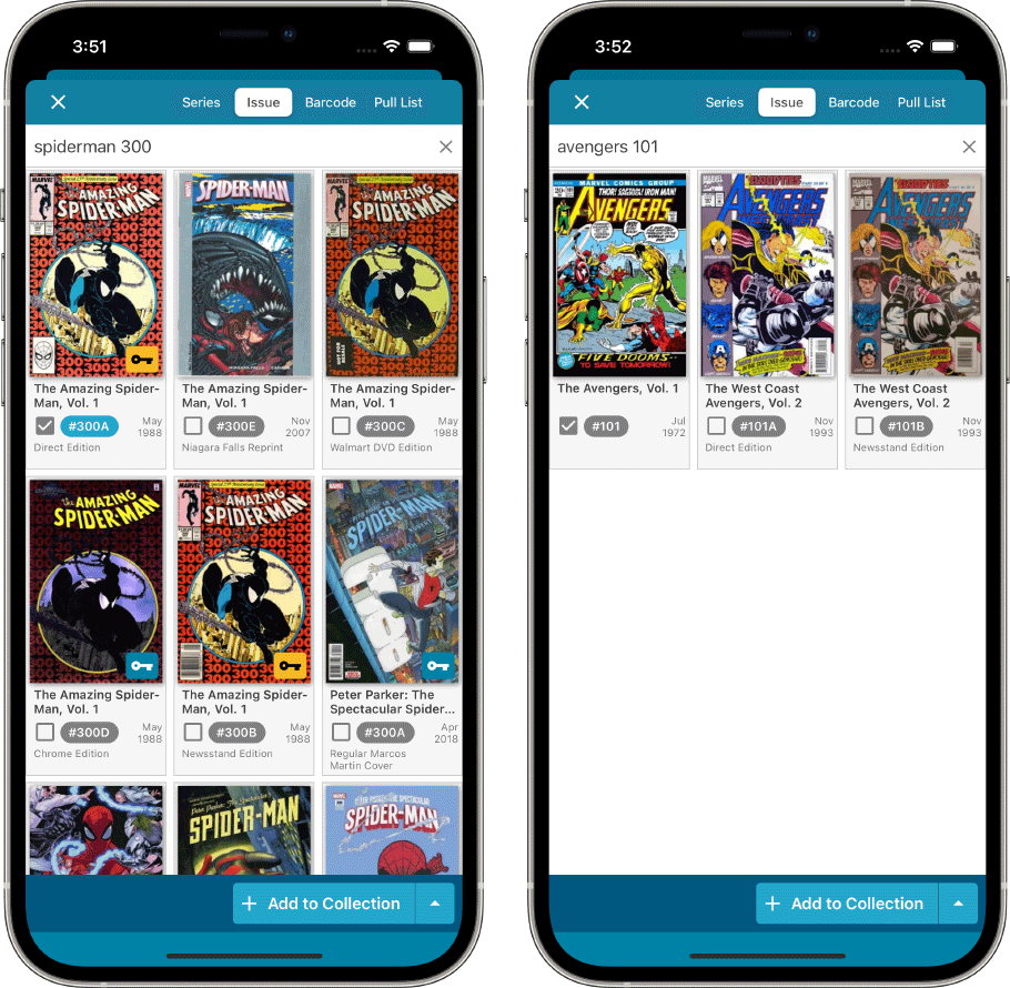
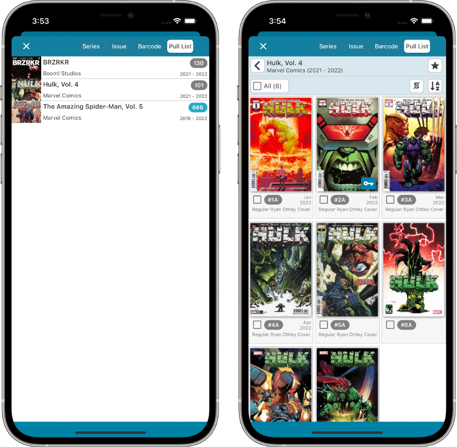
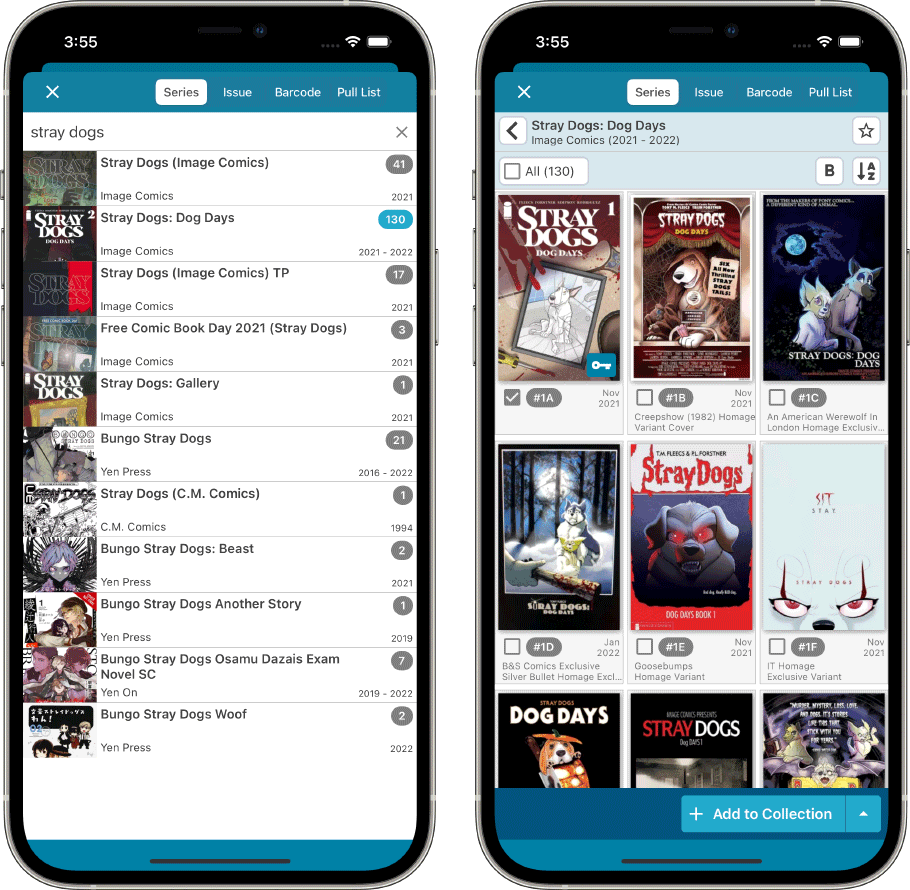
To make it easier to find and select the issue or variant that you own, we increased the size of the cover images in the Issue List. To make that possible, we turned the list into a grid, with multiple columns (most devices will show 3 columns).
The new Issue List layout now appears on the Add By Series tab, the Add by Issue Tab and the Pull List tab:
Add by Series
Add by Issue
Pull List
The Issue List for a series now opens in a separate page
Previously, on the Series and Pull List tabs, the issue list for a series expanded “in place”. But to give the issue list the full screen space, and to create a clearer user interface, the Issue List now opens on its own page. With a nice Series header and its own toolbar with the issue list settings. Use the back button top left to go back to the series list.
Preview Page now also shows a bigger cover image
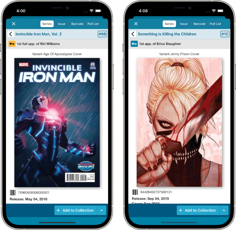
Also new in this update, a new layout for the Preview Page, with a big cover image and the Key Info and Variant Description right at the top. Scroll down to see all the other details (plot, creators, characters).
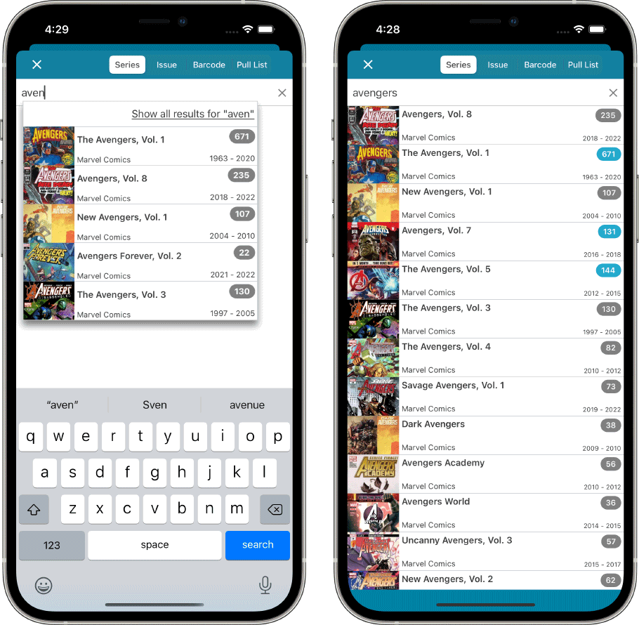
New look for series search results and series search “suggestions box”
The look of the Series list has been updated to match the series list design on the main screen. So with lower list entries, so that more entries fit on the screen. Of course the series search “suggestions” dropdown got the same treatment.
